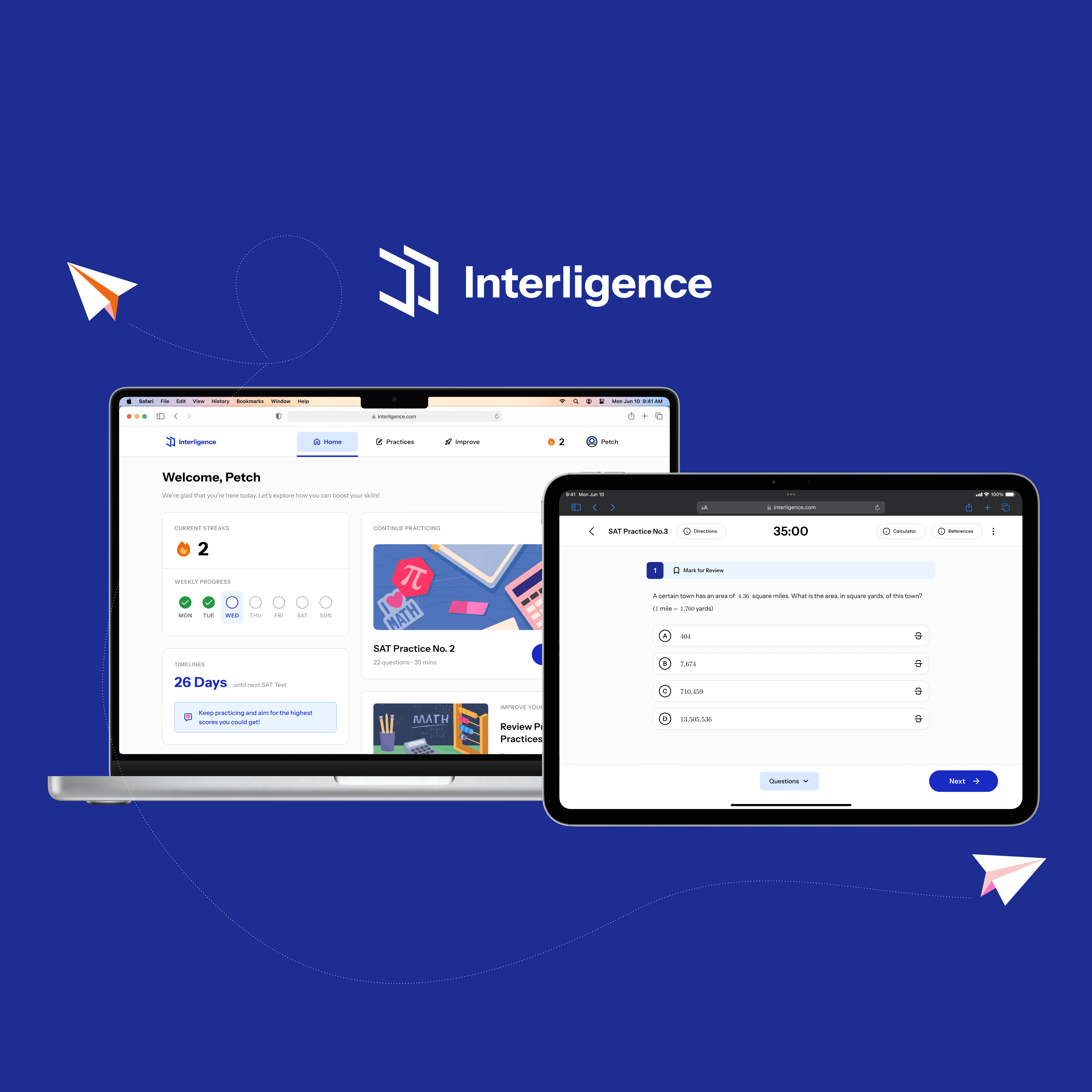
HealthBuddy
HealthBuddy is a mobile application designed to empower individuals with multiple diagnoses to monitor their vital health metrics and dietary habits in one intuitive, user-friendly experience. The app aims to help users uncover how specific foods affect their overall health by combining health data and food intake into a centralized platform. HealthBuddy removes the barriers of fragmented tracking systems by creating a singular, guided, and customizable monitoring tool, built with inclusivity and simplicity as its core.
ROLES
UX/UI Designer, UX Researcher
TIMELINE
Nov 2023

PROBLEM
Too many apps. Too many things to learn. Too much confusion
Recording data on mobile health apps is especially challenging for people managing multiple conditions. Most are forced to juggle several applications, each of which has its own navigation, design, and limited functionality. Users often struggle to connect health outcomes, such as elevated blood pressure or glucose, with their dietary choices, missing the bigger picture of cause and effect. The lack of an integrated tool not only burdens their daily routine but also limits their ability to take proactive steps toward better health.
"How might we create an application with features that could be used for health monitoring, such as recording vital health information like blood pressure, heart rate, blood oxygen level, and body temperature, as well as diet information such the foods and beverages consumed at each meal."

Research
Despite growing market demand, users still struggle with clarity and simplicity
In the first phase, we conducted quantitative research through surveys, qualitative research via in-depth user interviews, and market analysis to uncover pain points in existing health monitoring apps. These insights revealed a critical gap: while the market for health apps is rapidly expanding, current solutions fail to deliver the clarity, integration, and ease of use that users truly need.
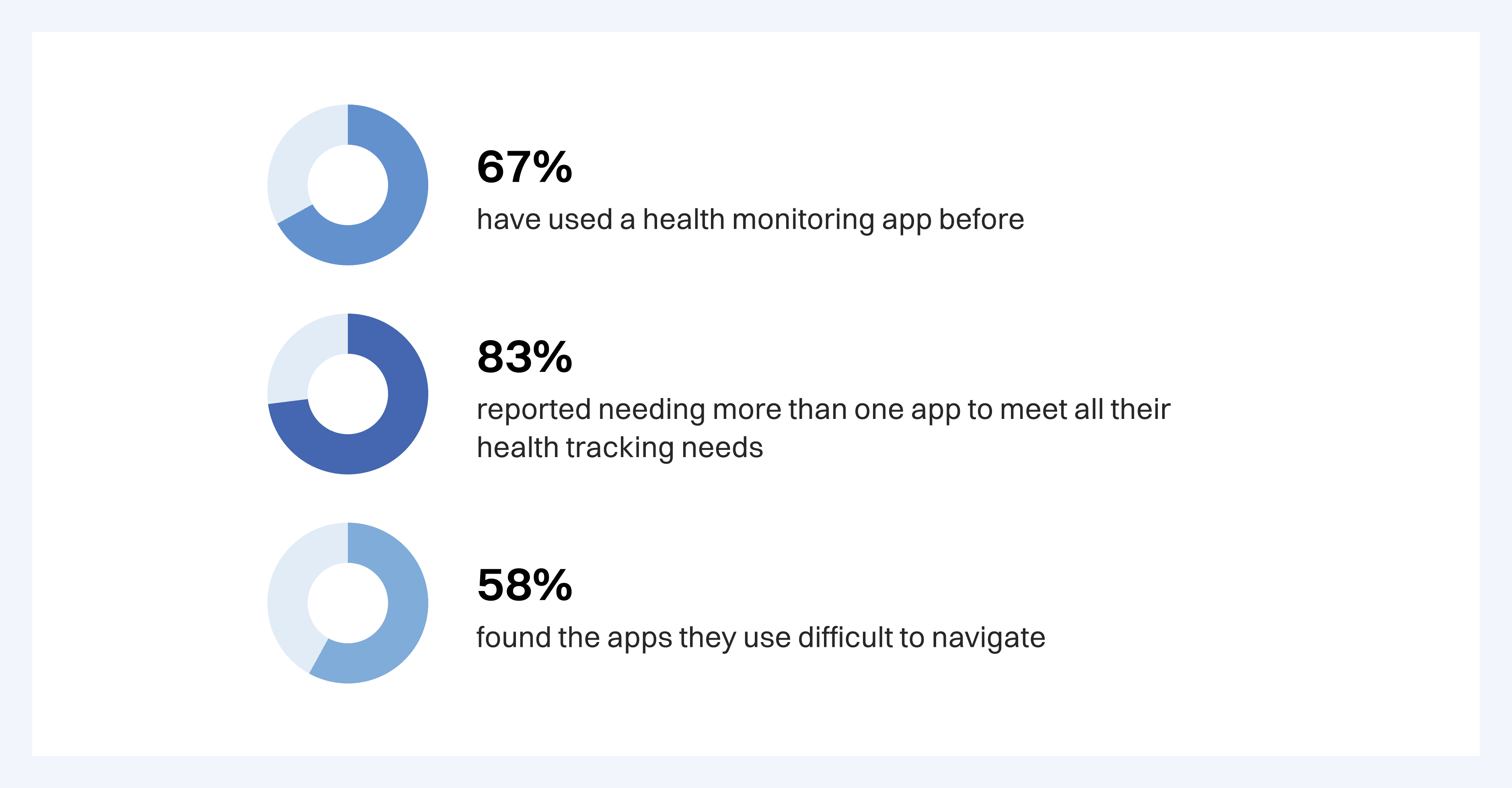
Quantitative Research
A survey conducted with 12 participants aged 18 to 50 revealed that
Qualitative Research
In-depth interviews with four individuals provided key insights:
Health apps often require irrelevant or overly technical data inputs.
Switching between apps for different metrics caused confusion and missed records.
Users wanted only necessary, understandable inputs with exportable summaries for doctors.

Market Research
In 2022, the global market for health monitoring apps reached $4.82 billion and is projected to hit $19 billion by 2032, with a CAGR of 14.7%.
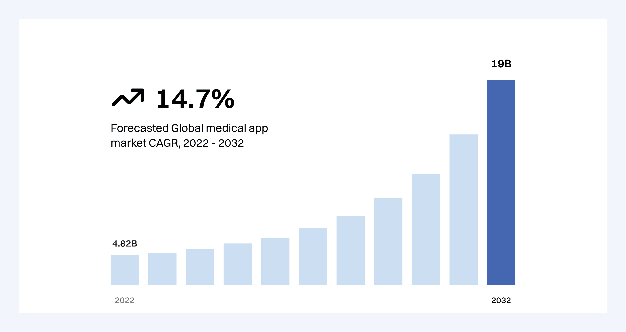
This growth is largely driven by rising awareness of chronic conditions like diabetes and cardiovascular disease. As more people seek tools to monitor their health remotely, HealthBuddy taps into a significant and growing demand for integrated, user-centric health solutions.
Defining & Ideation
Designing features that directly reflect users' needs and pain points.
To guide our design decisions, we first defined the core user needs through a detailed persona and an empathy map.
Persona
Our persona, Daisy, a 48-year-old business owner managing type 2 diabetes and hypertension, highlighted the daily struggle of toggling between different apps, confusion with medical terminology, and the desire for a simpler experience.

Empathy Map

Using Daisy’s pain points, goals, and emotional journey as a foundation, we defined the following key features in the ideation phase:
Centralized Health & Diet Logging: All health metrics and food tracking combined into a single, easy-to-use interface.
Customizable Input Fields: Only show data fields relevant to the user’s conditions, reducing overwhelm.
Data Visualization: Intuitive graphs that connect food intake with health metric changes over time.
Multi-Format Exporting: Allow users to export their records in PDF, CSV, or XLSX for doctors.
Medication Tracking: A clear, accessible section to input and view medications.
Linked Devices: Support for syncing data directly from remote health devices.
These features were ideated specifically to align with the persona's goals of clarity, control, and simplicity while solving frustrations like fragmented tools, irrelevant inputs, and the inability to export useful summaries.
Executions
Keep it simple and straightforward: Translating user needs into a cohesive and supportive experience.
In this phase, we began by organizing core tasks into a structured information architecture, developed low-fidelity wireframes to validate usability early, and iterated toward high-fidelity designs that align with user expectations, minimizing user effort while maximizing clarity and engagement.
Information Architecture & User Flow
We began by mapping out the full structure of the app based on user tasks. This helped ensure that all features were organized logically and aligned with user mental models.

Wireframes
Low-fidelity wireframes were developed to quickly test layout logic and content hierarchy. We also iterated these wireframes based on feedback, simplifying forms and prioritizing visual clarity for users unfamiliar with medical terminology.

Usability Testing
We tested the prototype with the four interviewees with 4 main tasks, including signing up & logging in, adding new health & food entries, viewing charts and summaries, exporting data to file formats. The results show the following key insights:
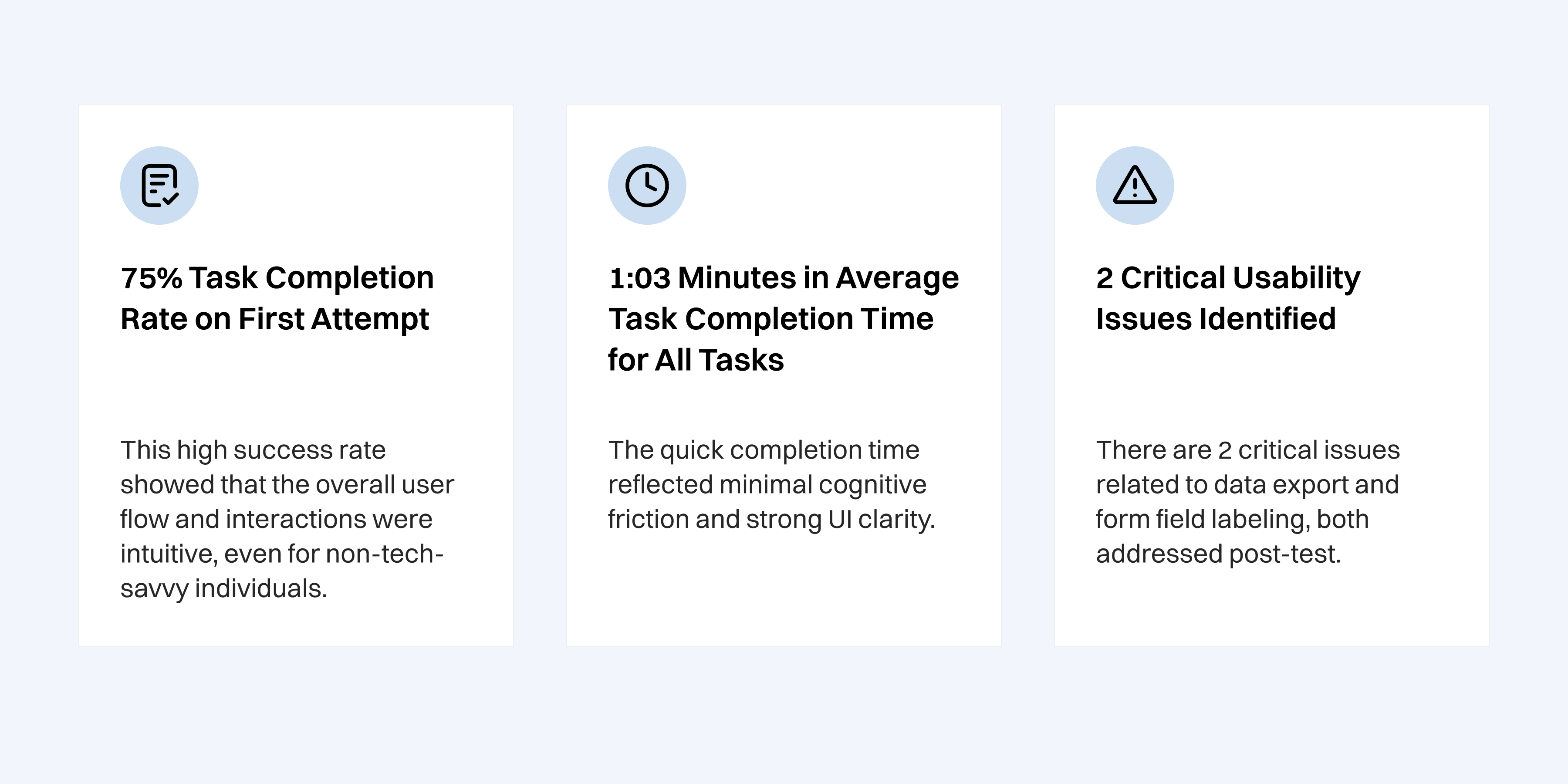
Results
Streamlining daily health tracking into a single, seamless experience
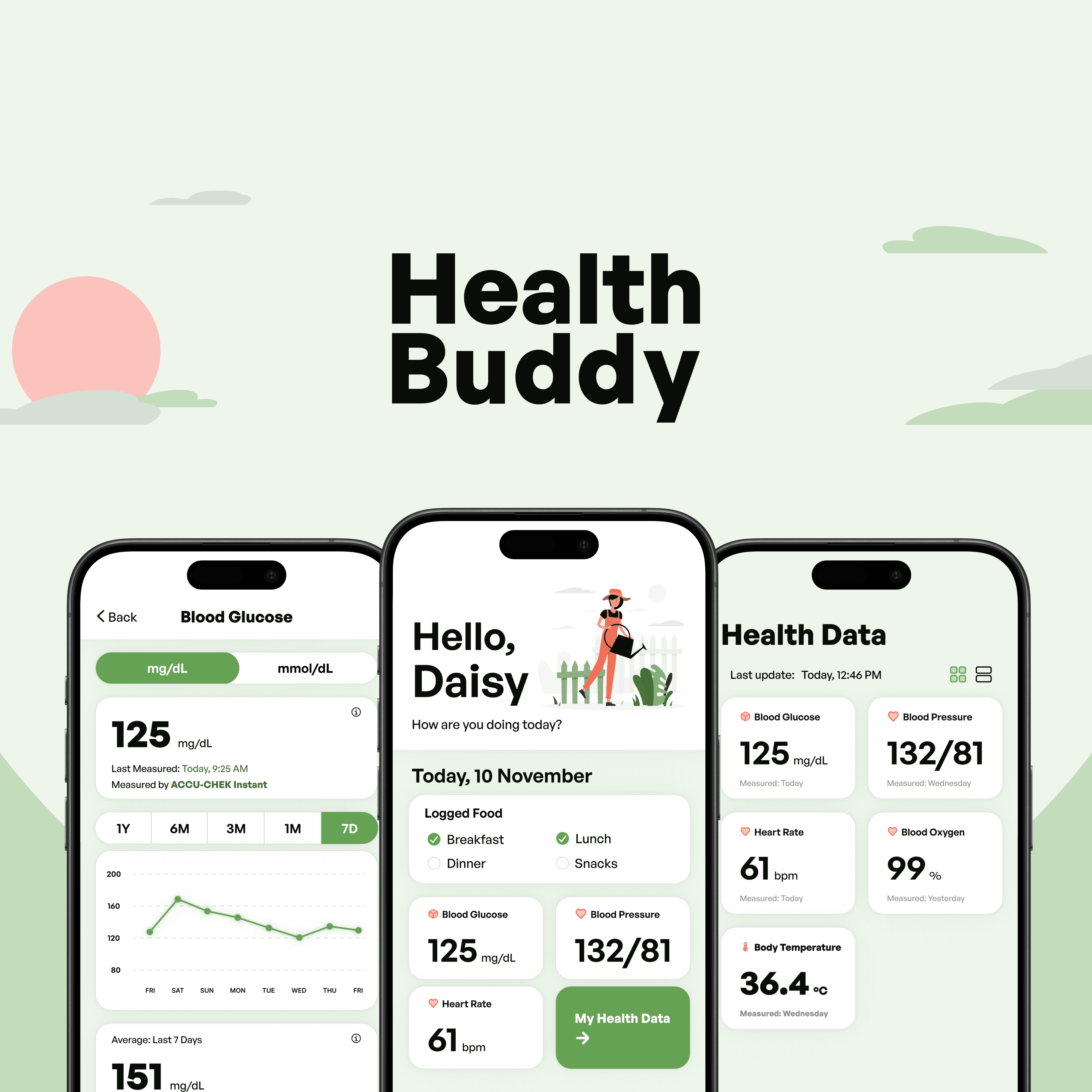
The final product of HealthBuddy successfully combined health and dietary tracking into one cohesive platform, designed with simplicity, personalization, and clarity in mind. Through iterative testing and thoughtful execution, we achieved a complete experience that directly addresses our users' needs.
Centralized Health & Food Logging
Add entries for vital signs (blood pressure, glucose, heart rate, etc.) and food consumption within a unified interface, reducing app-switching and confusion.
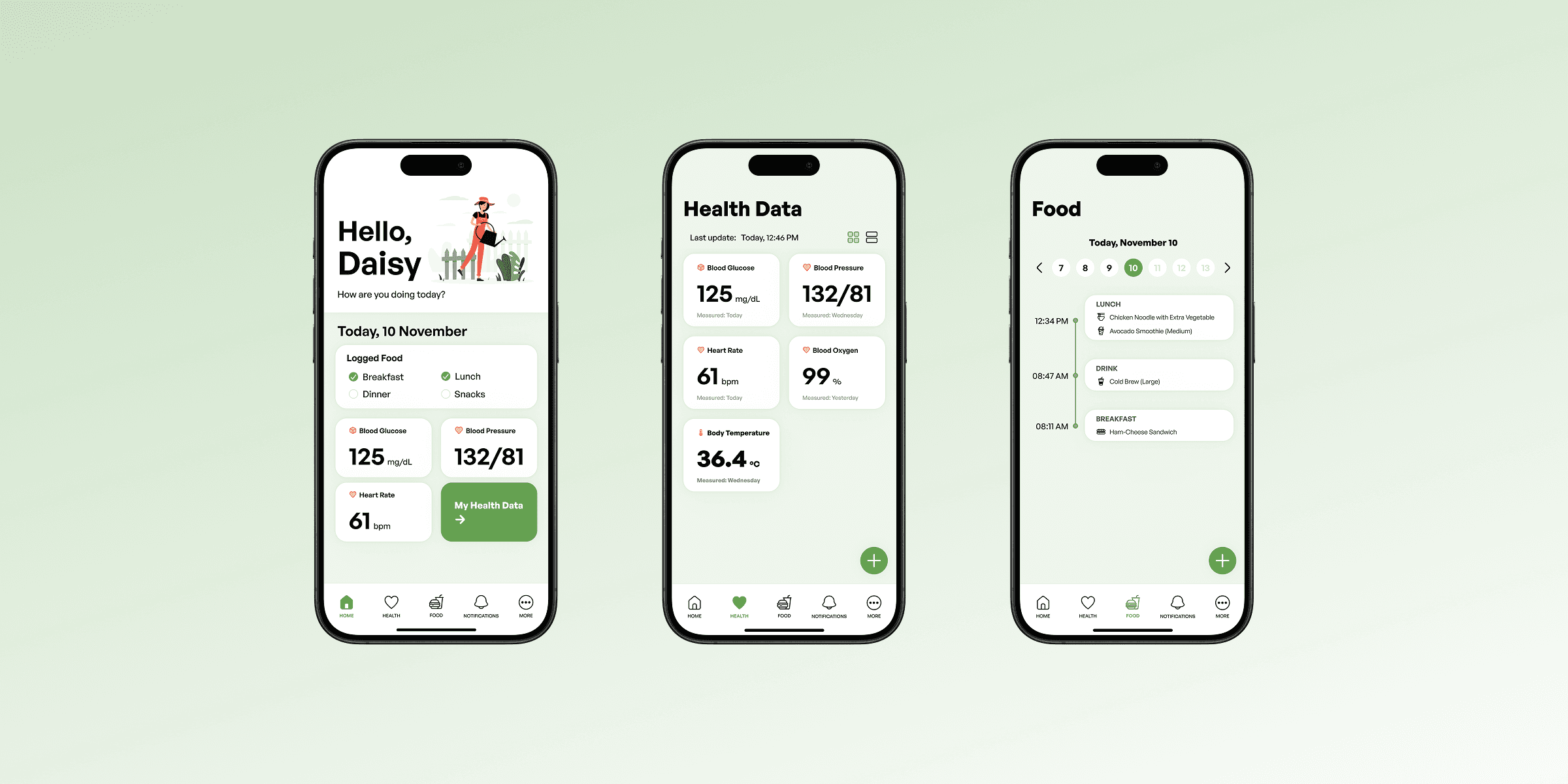
Visual Health Insights
Interactive charts help users visualize trends and correlations between food intake and changes in health metrics over time.
Customizable Input Fields
Users can choose which health categories to track and hide irrelevant fields, allowing a personalized and less overwhelming experience.

Seamless Cross-Device Sharing
Measures data directly from the app through linking external devices.
Medication Tracking
Log, review, and manage medication entries as part of their daily health routine.

Lessons Learned
Health is not something difficult to understand, if done right
HealthBuddy taught me that the real challenge in health tech isn't about building more features, but making health feel approachable and manageable. Good health design meets people where they are guiding without overwhelming, informing without intimidating. This project reaffirmed that when UX is done right, even something as complex as health becomes understandable, actionable, and empowering.
Next Steps
As my very first UX/UI case study, HealthBuddy reflects both my enthusiasm and the inevitable imperfections of a learning process. While the design meets key user needs and solves a real-world problem, there are many aspects, from visual consistency to micro-interactions and accessibility that I now recognize could be improved. Still, this project gave me a clear understanding of how design choices impact everyday users, especially in sensitive areas like health. A future redesign is planned with stronger visual systems, refined flows, and more advanced user testing to elevate the experience even further.